Simulate Color Blindness in CSS (feColorMatrix + Filters)
2026-03-15 · Jamie Chen · 12 min read
TL;DR: Preview CVD in CSS or skip to the live simulator for URL and image checks.
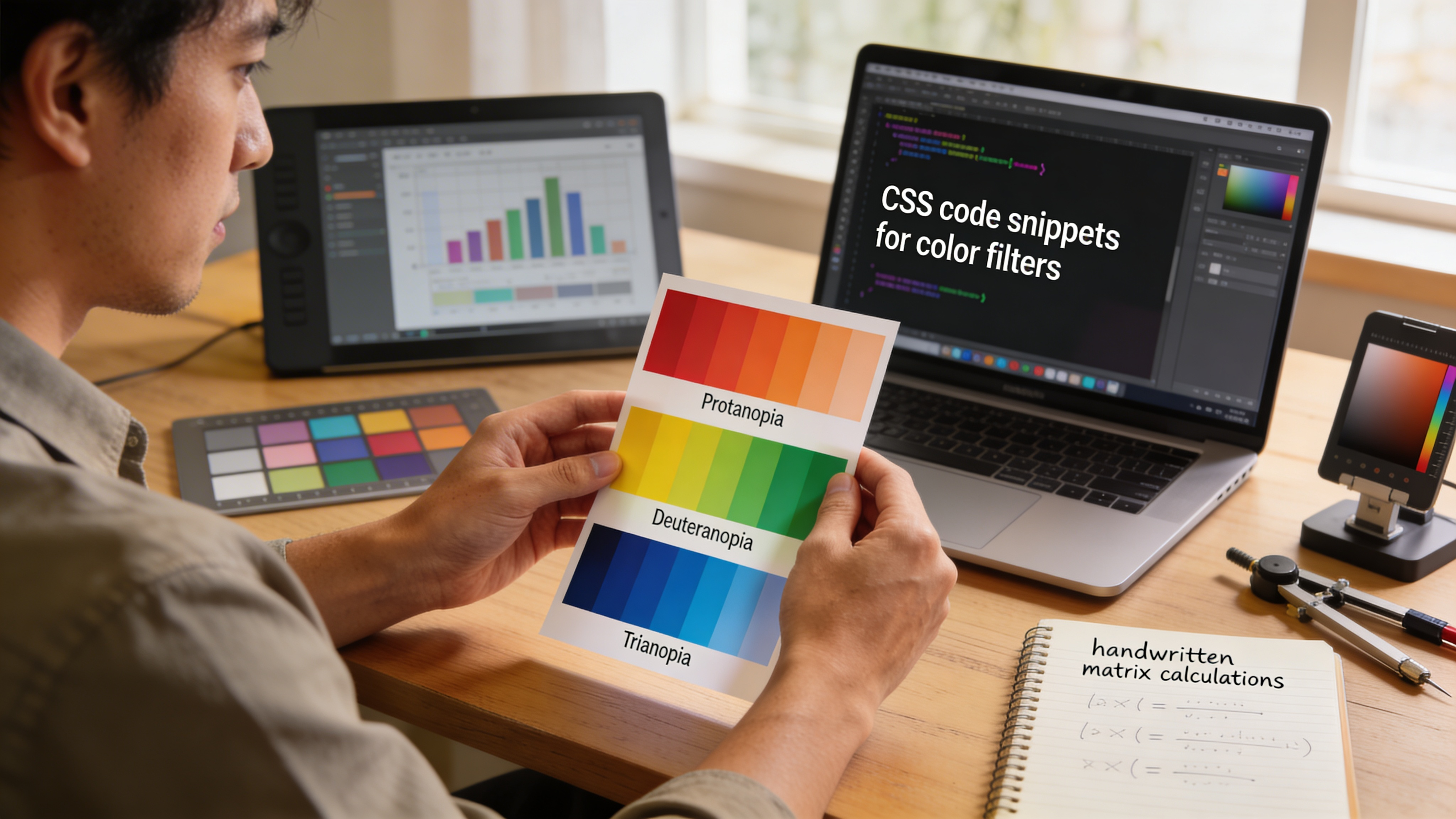
You’re three weeks into a redesign. The new dashboard looks sharp in your browser. Charts pop. Data hierarchies are clear. Your stakeholder approves it. Then an email lands: “I can’t distinguish the red and green pie slices.”
That’s the moment most developers realize they’ve never actually seen their design through the eyes of someone with color vision deficiency at least not intentionally, not with code.
CSS-based CVD simulation lets you catch these moments before they become customer complaints. Unlike manual testing with external tools, you can embed color blindness simulation directly into your development workflow live-reload it, compare side-by-side, version-control the test, and integrate it into CI/CD pipelines.
This guide walks through the technical approaches: CSS filters (the quick way), SCSS mixins (the maintainable way), JavaScript-driven matrix transforms (the accurate way), and practical integration patterns you can deploy today.
Why CSS simulation matters for developers
The traditional approach to accessibility testing is reactive: design something, export it, upload it to a simulator, check the results, go back to Figma, iterate. You’re context-switching constantly.
CSS-based simulation keeps you in the browser. You can:
- Test during development: Toggle a class and see deuteranopia instantly without leaving your IDE
- Create persistent test suites: Write CSS that simulates CVD as part of your storybook or component library
- Automate accessibility checks: Pipe CSS filters through automated screenshot comparison tools
- Reduce tool dependency: No third-party uploads, no rate limits, full control over the transformation algorithm
- Version-control your tests: Simulation code lives in git alongside your component tests
The trade-off is accuracy. CSS filters are approximations. They’re fast and convenient, but they don’t model the underlying color perception mechanisms the way peer-reviewed matrices do. For that reason, CSS simulation works best as a continuous developer check not a substitute for final validation with actual simulation tools or user testing.
CSS filters: the fastest approach
The quickest path to CVD simulation is the CSS filter property. Browsers support several filter functions that can approximate color blindness effects:
.simulate-deuteranopia {
  filter: url(#deuteranopia-filter);
}

.simulate-protanopia {
  filter: url(#protanopia-filter);
}

.simulate-tritanopia {
  filter: url(#tritanopia-filter);
}
But browser-native filters don’t have built-in color blindness modes. You need to define custom SVG filters that apply color matrix transforms the mathematical foundation of any CVD simulation.
Here’s a practical SVG filter definition for deuteranopia (green-blind):
<svg style="display: none;">
  <defs>
    <filter id="deuteranopia-filter">
      <feColorMatrix type="matrix" values="
        0.625 0.375 0.0   0 0
        0.7   0.3   0.0   0 0
        0.0   0.3   0.7   0 0
        0.0   0.0   0.0   1 0
      "/>
    </filter>
  </defs>
</svg>
The matrix values represent a linear color transformation. Each row corresponds to one output channel (red, green, blue, alpha). The columns multiply against input RGB values. This particular matrix is a simplified approximation based on Machado et al.’s research the same algorithm used in peer-reviewed CVD simulators.
Apply it to any element:
.simulate-deuteranopia {
  filter: url(#deuteranopia-filter);
}
Now any element with that class renders as it appears to someone with deuteranopia. The effect cascades to children:
<div class="dashboard simulate-deuteranopia">
  <!-- All charts, icons, text within inherit the filter -->
  <div class="chart"></div>
  <div class="legend"></div>
</div>
Pre-built SVG filter library
Rather than manually writing filter definitions, you can include a reusable SVG library in your HTML template:
<svg style="display: none;" aria-hidden="true">
  <defs>
    <!-- Protanopia (red-blind) -->
    <filter id="protanopia">
      <feColorMatrix type="matrix" values="
        0.567 0.433 0.0   0 0
        0.558 0.442 0.0   0 0
        0.0   0.242 0.758 0 0
        0.0   0.0   0.0   1 0
      "/>
    </filter>

    <!-- Deuteranopia (green-blind) -->
    <filter id="deuteranopia">
      <feColorMatrix type="matrix" values="
        0.625 0.375 0.0   0 0
        0.7   0.3   0.0   0 0
        0.0   0.3   0.7   0 0
        0.0   0.0   0.0   1 0
      "/>
    </filter>

    <!-- Tritanopia (blue-blind) -->
    <filter id="tritanopia">
      <feColorMatrix type="matrix" values="
        0.95  0.05  0.0   0 0
        0.0   0.433 0.567 0 0
        0.0   0.475 0.525 0 0
        0.0   0.0   0.0   1 0
      "/>
    </filter>

    <!-- Achromatopsia (complete color blindness) -->
    <filter id="achromatopsia">
      <feColorMatrix type="matrix" values="
        0.299 0.587 0.114 0 0
        0.299 0.587 0.114 0 0
        0.299 0.587 0.114 0 0
        0.0   0.0   0.0   1 0
      "/>
    </filter>
  </defs>
</svg>
Pair this with a utility class system:
.cvd-simulate-protanopia {
  filter: url(#protanopia);
}

.cvd-simulate-deuteranopia {
  filter: url(#deuteranopia);
}

.cvd-simulate-tritanopia {
  filter: url(#tritanopia);
}

.cvd-simulate-achromatopsia {
  filter: url(#achromatopsia);
}
Now toggle CVD simulation on any component using standard class names:
<button onclick="document.body.classList.toggle('cvd-simulate-deuteranopia')">
  Toggle deuteranopia simulation
</button>
Limitations of SVG filters:
- Filter definitions must be in the same DOM (cannot load from external files reliably)
- Performance degrades on large, complex pages with heavy animations
- Some browsers apply filters to all descendants, which can be resource-intensive
- Matrix values are approximations; they don’t perfectly match peer-reviewed algorithms
For quick QA checks during local development, SVG filters are excellent. For production-grade accessibility validation, pair them with external tools.
SCSS mixins: making CVD simulation maintainable
Hard-coding filter classes everywhere is unmaintainable. Use SCSS mixins to abstract CVD simulation into reusable, parameterized functions:
// Define CVD filter URLs once
$cvd-filters: (
  protanopia: url(#protanopia),
  deuteranopia: url(#deuteranopia),
  tritanopia: url(#tritanopia),
  achromatopsia: url(#achromatopsia)
);

// Mixin: apply CVD filter
@mixin simulate-cvd($type: deuteranopia) {
  @if map-has-key($cvd-filters, $type) {
    filter: map-get($cvd-filters, $type);
  } @else {
    @warn "CVD type '#{$type}' not recognized. Use: protanopia, deuteranopia, tritanopia, achromatopsia";
  }
}

// Mixin: generate CVD test mode (toggle class)
@mixin cvd-test-mode($selector: '.cvd-test') {
  #{$selector} {
    @each $type, $filter-url in $cvd-filters {
      &--#{$type} {
        filter: $filter-url;
      }
    }
  }
}

// Generate utility classes
@include cvd-test-mode('.simulate-cvd');

// Usage in components
.chart {
  @include simulate-cvd(deuteranopia);
}

.dashboard-dark {
  background: #1a1a1a;

  &.cvd-test-mode {
    @include simulate-cvd(protanopia);
  }
}
This approach scales. Your component library can expose CVD simulation as a first-class feature:
// _chart.scss
.chart {
  &.accessibility-test--deuteranopia {
    @include simulate-cvd(deuteranopia);
  }

  &.accessibility-test--protanopia {
    @include simulate-cvd(protanopia);
  }

  &.accessibility-test--tritanopia {
    @include simulate-cvd(tritanopia);
  }

  &.accessibility-test--achromatopsia {
    @include simulate-cvd(achromatopsia);
  }
}
Teams can now document CVD accessibility per component without duplicating CSS.
JavaScript-driven matrix transforms: accuracy and control
SVG filters are convenient but static. For programmatic control think real-time severity adjustment, dynamic color space conversion, or integration with accessibility audit tools you need JavaScript.
Here’s a practical pattern using Canvas or CSS custom properties to apply color matrices dynamically:
// Color transformation matrices (Machado et al., 2009)
const CVD_MATRICES = {
  protanopia: [
    [0.567, 0.433, 0.0],
    [0.558, 0.442, 0.0],
    [0.0, 0.242, 0.758]
  ],
  deuteranopia: [
    [0.625, 0.375, 0.0],
    [0.7, 0.3, 0.0],
    [0.0, 0.3, 0.7]
  ],
  tritanopia: [
    [0.95, 0.05, 0.0],
    [0.0, 0.433, 0.567],
    [0.0, 0.475, 0.525]
  ],
  achromatopsia: [
    [0.299, 0.587, 0.114],
    [0.299, 0.587, 0.114],
    [0.299, 0.587, 0.114]
  ]
};

// Apply matrix transformation to RGB
function transformColor(r, g, b, matrix) {
  const [row1, row2, row3] = matrix;
  return [
    Math.round(row1[0] * r + row1[1] * g + row1[2] * b),
    Math.round(row2[0] * r + row2[1] * g + row2[2] * b),
    Math.round(row3[0] * r + row3[1] * g + row3[2] * b)
  ];
}

// Example: Transform a single hex color
function simulateCVDColor(hexColor, cvdType = 'deuteranopia', severity = 1.0) {
  const r = parseInt(hexColor.slice(1, 3), 16);
  const g = parseInt(hexColor.slice(3, 5), 16);
  const b = parseInt(hexColor.slice(5, 7), 16);

  const matrix = CVD_MATRICES[cvdType];
  if (!matrix) throw new Error(`Unknown CVD type: ${cvdType}`);

  const [r2, g2, b2] = transformColor(r, g, b, matrix);

  // Blend original and transformed based on severity (0 = no change, 1 = full transform)
  const blendedR = Math.round(r + (r2 - r) * severity);
  const blendedG = Math.round(g + (g2 - g) * severity);
  const blendedB = Math.round(b + (b2 - b) * severity);

  return `#${[blendedR, blendedG, blendedB]
    .map(x => x.toString(16).padStart(2, '0'))
    .join('')}`;
}

// Test it
console.log(simulateCVDColor('#FF0000', 'deuteranopia'));
// Output: #FFAA00 (red appears yellowish to someone with deuteranopia)
This enables severity control a key feature of production accessibility tools:
// User adjusts a severity slider from 0 100
function applyDynamicCVDSimulation(severity) {
  const cvdType = 'deuteranopia';
  const matrix = CVD_MATRICES[cvdType];
  const severityFraction = severity / 100;

  // Interpolate between original and fully transformed
  const interpolatedMatrix = matrix.map(row =>
    row.map((val, i) => {
      const original = i === 0 ? 1 : 0; // Identity matrix diagonal
      return original + (val - original) * severityFraction;
    })
  );

  // Convert to CSS filter value
  const flatMatrix = interpolatedMatrix.flat().join(' ');
  return `filter: url(#custom-cvd); --cvd-matrix: ${flatMatrix};`;
}
Canvas-based pixel manipulation
For the most control especially when testing images process pixels directly on Canvas:
async function simulateImageCVD(imageURL, cvdType = 'deuteranopia') {
  const canvas = document.createElement('canvas');
  const ctx = canvas.getContext('2d');
  const img = new Image();

  img.onload = () => {
    canvas.width = img.width;
    canvas.height = img.height;
    ctx.drawImage(img, 0, 0);

    const imageData = ctx.getImageData(0, 0, canvas.width, canvas.height);
    const data = imageData.data;
    const matrix = CVD_MATRICES[cvdType];

    // Process every pixel
    for (let i = 0; i < data.length; i += 4) {
      const r = data[i];
      const g = data[i + 1];
      const b = data[i + 2];
      const a = data[i + 3];

      const [r2, g2, b2] = transformColor(r, g, b, matrix);
      data[i] = r2;
      data[i + 1] = g2;
      data[i + 2] = b2;
      data[i + 3] = a; // Preserve alpha
    }

    ctx.putImageData(imageData, 0, 0);
    return canvas.toDataURL('image/png');
  };

  img.src = imageURL;
}
This is computationally expensive for large images, so use it selectively during design review or in storybook previews, not on every page load.
Integrating CVD simulation into component libraries
The real power emerges when you embed CVD testing into your design system. Here’s a pattern for Storybook:
// .storybook/decorators.js
import { CVD_MATRICES, transformColor } from '../src/utils/cvd';

export const CVDDecorator = (Story, context) => {
  const { cvdType, severity } = context.globals;

  if (!cvdType || cvdType === 'normal') {
    return Story();
  }

  return (
    <div style={{ filter: `url(#${cvdType}-filter)` }}>
      <Story />
    </div>
  );
};

// .storybook/preview.js
import { addDecorator, addParameters } from '@storybook/react';
import { CVDDecorator } from './decorators';

addDecorator(CVDDecorator);

addParameters({
  globals: {
    cvdType: 'normal',
    severity: 100
  }
});

// Add global toolbar button for CVD selection
export const globalTypes = {
  cvdType: {
    name: 'CVD Simulation',
    description: 'Simulate color vision deficiency',
    defaultValue: 'normal',
    toolbar: {
      icon: 'eye',
      items: [
        { value: 'normal', title: 'Normal vision' },
        { value: 'protanopia', title: 'Protanopia (red-blind)' },
        { value: 'deuteranopia', title: 'Deuteranopia (green-blind)' },
        { value: 'tritanopia', title: 'Tritanopia (blue-blind)' },
        { value: 'achromatopsia', title: 'Achromatopsia (color-blind)' }
      ]
    }
  }
};
Now every component story in your library can be previewed under any CVD type with a single toolbar click. This scales accessibility testing across your entire design system.
Automated screenshot testing with CVD filters
Combine CSS filters with visual regression testing tools (Percy, Chromatic, BackstopJS) to catch color accessibility regressions in CI/CD:
// backstop.config.js
module.exports = {
  scenarios: [
    {
      label: 'Dashboard   Normal vision',
      url: 'http://localhost:3000/dashboard',
      referenceUrl: 'http://reference.local/dashboard',
      selectors: ['main', '.dashboard'],
      hideSelectors: [],
      removeSelectors: [],
      readyEvent: null,
      readySelector: null,
      delay: 500,
      hideScrollbars: false,
      keyPressSelectors: [],
      clickSelectors: [],
      postInteractionWait: 0,
      selectorExpansion: true,
      expect: 0,
      misMatchThreshold: 0.1,
      requireSameDimensions: true
    },
    {
      label: 'Dashboard   Deuteranopia simulation',
      url: 'http://localhost:3000/dashboard?cvd=deuteranopia',
      onBefore: 'document.body.classList.add("simulate-deuteranopia")',
      selectors: ['main', '.dashboard'],
      misMatchThreshold: 0.1
    },
    {
      label: 'Dashboard   Protanopia simulation',
      url: 'http://localhost:3000/dashboard?cvd=protanopia',
      onBefore: 'document.body.classList.add("simulate-protanopia")',
      selectors: ['main', '.dashboard'],
      misMatchThreshold: 0.1
    }
  ]
};
Each test captures and compares screenshots across normal and simulated CVD states. If a color change breaks contrast or reduces distinction, the test fails catching accessibility regressions before they ship.
Performance considerations
CSS filters and SVG transforms are GPU-accelerated on most modern browsers, but performance degrades with scale:
- Large complex pages (>100 interactive elements): filters may cause jank, especially on older devices
- Real-time animations: combining filters with CSS animations can reduce frame rates
- Mobile: Safari and Chrome on iOS have variable filter performance
For development and QA, this rarely matters. For production-grade continuous testing:
- Apply filters to specific sections, not document-wide
- Use
will-change: filter;on high-frequency animations - Defer heavy transforms to workers or CI/CD systems (run tests headless, not in-browser)
- Profile with DevTools to measure actual impact on your components
Severity adjustment and interpolation
One limitation of static CSS filters is they represent 100% CVD. Real color vision deficiencies exist on a spectrum someone with mild protanopia experiences partial red desaturation, not total red blindness.
Implement severity control using CSS custom properties and calc():
:root {
  --cvd-severity: 1; /* 0 = normal, 1 = full CVD */
}

.simulate-cvd-interpolated {
  /* Blend filter opacity based on severity */
  filter: url(#deuteranopia-filter);
  opacity: calc(1 - (var(--cvd-severity) * 0.3)); /* Optional: reduce intensity */
}
Or interpolate the matrix itself using JavaScript:
function interpolateCVDMatrix(matrix, severity) {
  const identity = [
    [1, 0, 0],
    [0, 1, 0],
    [0, 0, 1]
  ];

  return matrix.map((row, i) =>
    row.map((val, j) => {
      const identityVal = identity[i][j];
      return identityVal + (val - identityVal) * severity;
    })
  );
}

// 0.5 = 50% severity (mild color deficiency simulation)
const mildDeuteranopia = interpolateCVDMatrix(CVD_MATRICES.deuteranopia, 0.5);
This mirrors real-world testing tools like DeficiencyView’s severity slider, giving you fine-grained control over exactly which shades fail accessibility checks.
Common mistakes and how to fix them
Mistake 1: Assuming CSS filters === peer-reviewed accuracy
CSS filters are approximations. They work for quick sanity checks but don’t replace thorough testing with tools that use scientifically validated algorithms. Always validate final designs with external simulators before considering a feature “color-accessible.”
Fix: Use CSS filters in development and Storybook for continuous checks, then run final validation through a tool like DeficiencyView’s color blindness simulator before launch.
Mistake 2: Filtering entire pages instead of components
Applying a global CVD filter to body or main affects text, images, and interactive elements indiscriminately. This creates false positives (things that look problematic in simulation but aren’t in real use).
Fix: Apply filters to specific components or sections. Test individual charts, buttons, and form fields in isolation:
.chart.cvd-test {
  filter: url(#deuteranopia-filter);
}

.form.cvd-test {
  filter: url(#deuteranopia-filter);
}
Mistake 3: Ignoring alternative visual encodings
Even with perfect color simulation, if your design only uses color to convey information (e.g., “red = error, green = success”), it fails for people with CVD. Filters alone can’t fix this.
Fix: Always pair color with text labels, icons, or patterns. A red alert box should also have an ⚠️ icon and “Error” text.
<!-- Bad: color-only indicator -->
<div class="status-red"></div>

<!-- Good: color + icon + text -->
<div class="status-error">
  <svg class="icon-error" aria-hidden="true"><!-- error icon --></svg>
  <span>Payment failed</span>
</div>
Mistake 4: Not testing with different CVD types
Protanopia, deuteranopia, and tritanopia render colors differently. A palette that passes deuteranopia simulation might still fail tritanopia.
Fix: Always test all four CVD types:
['protanopia', 'deuteranopia', 'tritanopia', 'achromatopsia'].forEach(cvdType => {
  console.log(`Testing ${cvdType}:`, simulateCVDColor('#FF5733', cvdType));
});
FAQ
What’s the difference between CSS filters and peer-reviewed CVD algorithms?
CSS filters apply approximate color matrix transformations that look similar to color blindness but don’t strictly follow the psychophysical models used in research. They’re sufficient for development-time checks but not scientific validation. For precise testing, use tools built on peer-reviewed matrices like Machado et al., 2009.
Can I use CSS filters in production for accessibility testing?
Yes, but with caveats. If you’re providing users with an accessibility toggle (e.g., “preview how this looks with protanopia”), CSS filters are a reasonable starting point. However, make it clear to users that it’s an approximation, not a clinical assessment. For production accessibility features, combine filters with actual contrast validation and WCAG compliance checks.
Why do the colors look different between my CSS filter and a professional simulator?
CSS filters use simplified matrix approximations for performance. Professional simulators like DeficiencyView use more sophisticated algorithms that account for monitor properties, background colors, and spatial context. For final validation, always use an external tool.
How do I test dynamically generated colors (e.g., user-supplied brand colors)?
Use the JavaScript approach: capture the hex value, transform it through the CVD matrix, and display both original and simulated versions side-by-side. This is especially useful for design tools and color pickers.
Can I combine CSS filters with animations without performance issues?
Filters + animations can reduce frame rates, especially on lower-end devices. Test with DevTools’ performance profiler. If jank occurs, apply the filter to a wrapper element and animate children instead, or use GPU-accelerated transforms like scale() or rotate() rather than filter during animations.
Should I use filters on images or just on HTML elements?
Both work. Use filter on <img> elements for static images. For interactive components with state changes, apply filters to container divs. For maximum control over pixel-level transforms, use Canvas and JavaScript.
Recommended testing workflow
- Local development: Toggle a CSS class to view deuteranopia/protanopia/tritanopia instantly
- Component QA: Test all states (hover, active, disabled) under each CVD type in Storybook
- Integration: Run automated screenshot tests in CI/CD comparing normal and CVD-simulated versions
- Pre-launch validation: Upload final designs to DeficiencyView’s color blindness simulator for peer-reviewed accuracy
- Iteration: Fix flagged issues, retest, validate
This layered approach catches most color accessibility issues without adding significant overhead to your development process.
Related Articles
- Color blind tools and testing workflows
- Testing your website for color blindness
- Designing for deuteranopia
To validate that your CSS simulations actually reflect real color blindness, take our free Ishihara-style color vision test and compare your results with how your simulated designs appear to you it’s a revealing alignment check.