Deuteranopia Design Guide: Test, Simulate & Build Inclusive UIs
2026-03-04 · DeficiencyView Team · 9 min read
TL;DR: Green-blind UX fails are common—run a deuteranopia test, then simulate your UI before ship.
Free screening: Start with the deuteranopia-focused hub and the 18-plate Ishihara-style test, then check UI in the simulator.
Designing for the color-blind community is not just a regulatory hurdle; it is a fundamental aspect of inclusive user experience. Deuteranopia, commonly known as “green-blindness,” affects millions of people by reducing the ability to distinguish between shades of green, yellow, and red. For designers, failing to account for this specific type of color vision deficiency (CVD) can render navigation menus, error states, and data visualizations completely illegible.
Running a reliable deuteranopia test during the prototyping phase is the most effective way to ensure your digital products remain functional for all users, regardless of their visual perception.
Understanding Deuteranopia in UI Design
Deuteranopia occurs when the medium-wavelength (M) cones in the retina are missing or malfunctioning. In a design context, this means that colors like forest green, lime, and certain shades of red often appear as shades of yellow or brownish-gray.
When you ignore these shifts, your broader accessibility tooling and checks may fall short. Relying on color alone to convey meaning such as a green “success” icon versus a red “alert” is a major accessibility failure that impacts the nearly 8% of men globally who live with some form of red-green CVD.
How to Conduct an Effective Deuteranopia Test
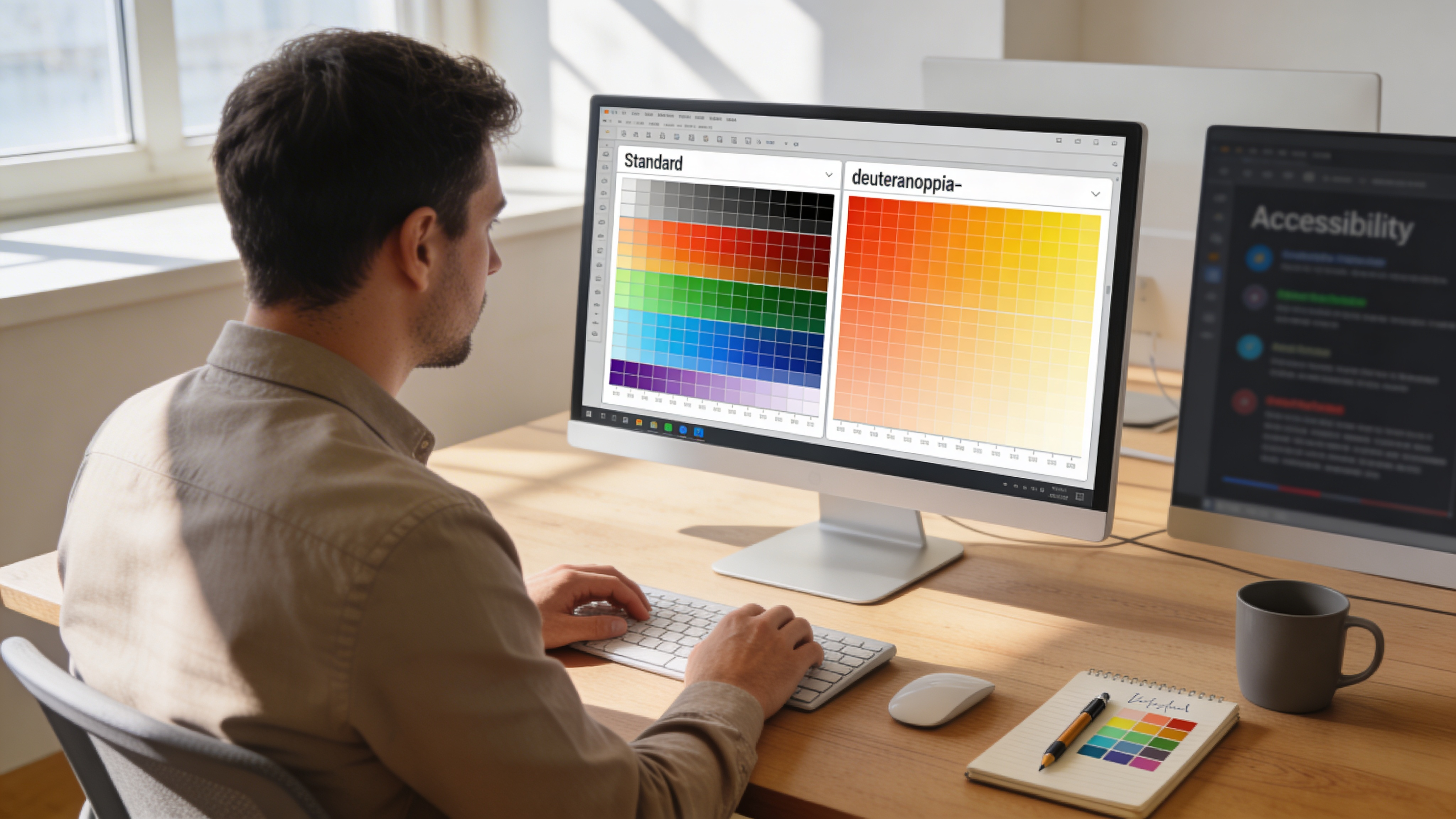
To bridge the accessibility gap, your workflow must include regular simulation. Rather than guessing how a color palette performs, you should use a professional-grade color blindness simulator to validate your choices in real time.
1. Evaluate Your Color Palette
Before building your component library, test your primary and secondary colors. If your brand palette relies heavily on green-red contrast, you may need to adjust the lightness and saturation values. You can check these ratios by using a WCAG contrast checker to ensure your text maintains a ratio of at least 4.5:1, even when simulated through a deuteranopia filter.
2. Implement Redundant Cues
The golden rule of accessible design is: never rely on color as the sole indicator. If your form uses a green border for valid inputs and a red border for errors, add a secondary indicator like a checkmark icon or an error message text. This redundancy makes your design usable for those with protanopia, deuteranopia, and complete achromatopsia.
3. Use Simulation Tools
Tools like color blindness simulator let you upload any image or enter a URL to instantly preview your work through deuteranopia, protanopia, and tritanopia filters. This allows you to identify “blind spots” in your typography or data charts before you push your code to production. A quick simulation run takes under a minute and can reveal contrast issues that might otherwise lead to a frustrating experience.
Building Deuteranopia-Friendly Colors
Creating a palette that works for everyone requires a systematic approach. Here are three tips for choosing accessible colors:
- Avoid Red-Green Pairs: If possible, swap red-green combinations for blue-orange or high-contrast monochromatic themes.
- Leverage Lightness (Lab):* Focus on the lightness of the color rather than the hue. Even if two colors look similar in hue, their lightness difference will remain distinct to most users.
- Pattern and Texture: Supplement your charts and graphs with distinct patterns or textures to differentiate categories, as explored in our introduction to color blindness guides.
Why Proactive Testing Matters
Accessibility, or “a11y,” is often treated as an afterthought in fast-paced product teams. However, when you integrate testing into your early design cycles, you avoid the technical debt of retrospective redesigns.
Whenever you test a design, remember that you are not just checking a box for compliance; you are designing for a significantly large user base. By using free color blind accessibility tools consistently, you ensure that your platform is welcoming to everyone. You can also utilize our free color blind test if you are interested in better understanding how your own team perceives color spectrums.
Summary Checklist for Designers
- Perform a simulation check on all core product states (hover, error, active).
- Ensure all functional colors meet WCAG 2.2 AA contrast standards.
- Use icons or text labels to supplement color-coded information.
- Audit your data visualizations using varied patterns.
- Verify your final mockups with a simulator to catch unexpected color blends.
By centering your process around these practices, you move from reactive accessibility to proactive, inclusive design.
Related Articles
- How to Use a Color Blind Simulator (Images, URLs & WCAG Checks)
- Website Color Blindness Audit: Steps, Tools & WCAG Alignment
- Free Online Color Blind Test: How to Interpret Your Results