Color Blind Simulator Guide: Test Images & Live URLs Free
2026-02-28 · DeficiencyView Team · 11 min read
TL;DR: Upload a mockup or paste a URL in the free color blind simulator—four CVD types, WCAG contrast included.
You’ve spent weeks perfecting your design. The color palette feels modern, the contrast looks sharp, and your stakeholders love it. Then you launch and discover that 8% of your male users can’t distinguish your error states from your success messages. Your carefully chosen red and green buttons look nearly identical to them.
This scenario plays out constantly across the digital landscape. Approximately 300 million people worldwide live with some form of color vision deficiency (CVD), yet most designers never test their work through the eyes of these users. A color blind simulator bridges this gap by transforming your designs in real time, revealing accessibility issues before they reach production.
In this guide, you’ll learn exactly how to use color blindness simulation tools effectively from understanding the different CVD types to building a bulletproof testing workflow that catches every potential issue. Whether you’re designing a mobile app, building a website, or creating data visualizations, these techniques will help you create accessible color palettes that work for everyone. Try the live color blindness simulator as you read.
If you want to follow along in real time, open the free color blindness simulator and test each section as you read.
What Is a Color Blind Simulator and Why Does It Matter?
A color blindness simulator is a tool that applies scientifically-derived color transformation algorithms to images, designs, or live websites showing you exactly how people with different types of color vision deficiency perceive your work.
Unlike simple color filters or guesswork, professional-grade simulators use peer-reviewed research (such as the Machado et al. 2009 color transformation matrices) to produce accurate representations of CVD vision. This accuracy matters because designing for accessibility isn’t about making things “good enough” it’s about ensuring full usability.
The Business Case for CVD Simulation
The numbers make the case compelling:
- 1 in 12 men (approximately 8%) have some form of color blindness
- 1 in 200 women (approximately 0.5%) experience CVD
- Red-green color blindness accounts for 99% of all CVD cases
- Global e-commerce loses billions annually to accessibility barriers
Beyond ethics and legal compliance (WCAG, ADA, Section 508), accessible design simply reaches more customers. When you understand cones, rods, and how CVD works, you design for the full spectrum of human vision not just the majority.
Understanding the Four Types of Color Vision Deficiency
Before diving into simulation workflows, you need to understand what you’re testing for. Each CVD type affects color perception differently, and effective testing requires checking all relevant variations.
Protanopia (Red-Blind)
Protanopia results from missing or damaged long-wavelength (red) cone cells. Users with protanopia:
- Cannot perceive red light
- See reds as dark browns, greens, or grays
- Confuse red with black in low-light conditions
- Struggle with red-on-black designs
This affects approximately 1% of males and creates significant issues with error states, warnings, and any design relying on red for meaning.
Deuteranopia (Green-Blind)
Deuteranopia involves missing or damaged medium-wavelength (green) cone cells. This is the most common form of color blindness, affecting roughly 6% of males. You can run a focused deuteranopia simulation test to see typical failure patterns. Users experience:
- Inability to perceive green light
- Confusion between reds, greens, browns, and oranges
- Difficulty distinguishing traffic lights without positional cues
- Problems with nature photography and environmental UI themes
The differences between protanopia and deuteranopia are subtle but important both are “red-green” color blindness, yet they affect different wavelengths.
Tritanopia (Blue-Blind)
Tritanopia is rare, affecting roughly 0.01% of the population. It results from missing or damaged short-wavelength (blue) cone cells. A dedicated tritanopia test is useful when blue-yellow confusion is a risk:
- Blues appear greenish
- Yellows appear pink or light gray
- Purple is often confused with red
- The blue-yellow spectrum is compressed
While uncommon, testing for tritanopia ensures comprehensive accessibility especially for designs heavy in blues and yellows.
Achromatopsia (Complete Color Blindness)
Achromatopsia is extremely rare (approximately 1 in 30,000 people) but represents the most severe CVD form:
- Complete absence of color perception
- Vision limited to grayscale
- Often accompanied by light sensitivity
- Relies entirely on luminance contrast
Testing for achromatopsia also validates that your designs work purely through contrast a useful check even for users with normal color vision in challenging lighting conditions.
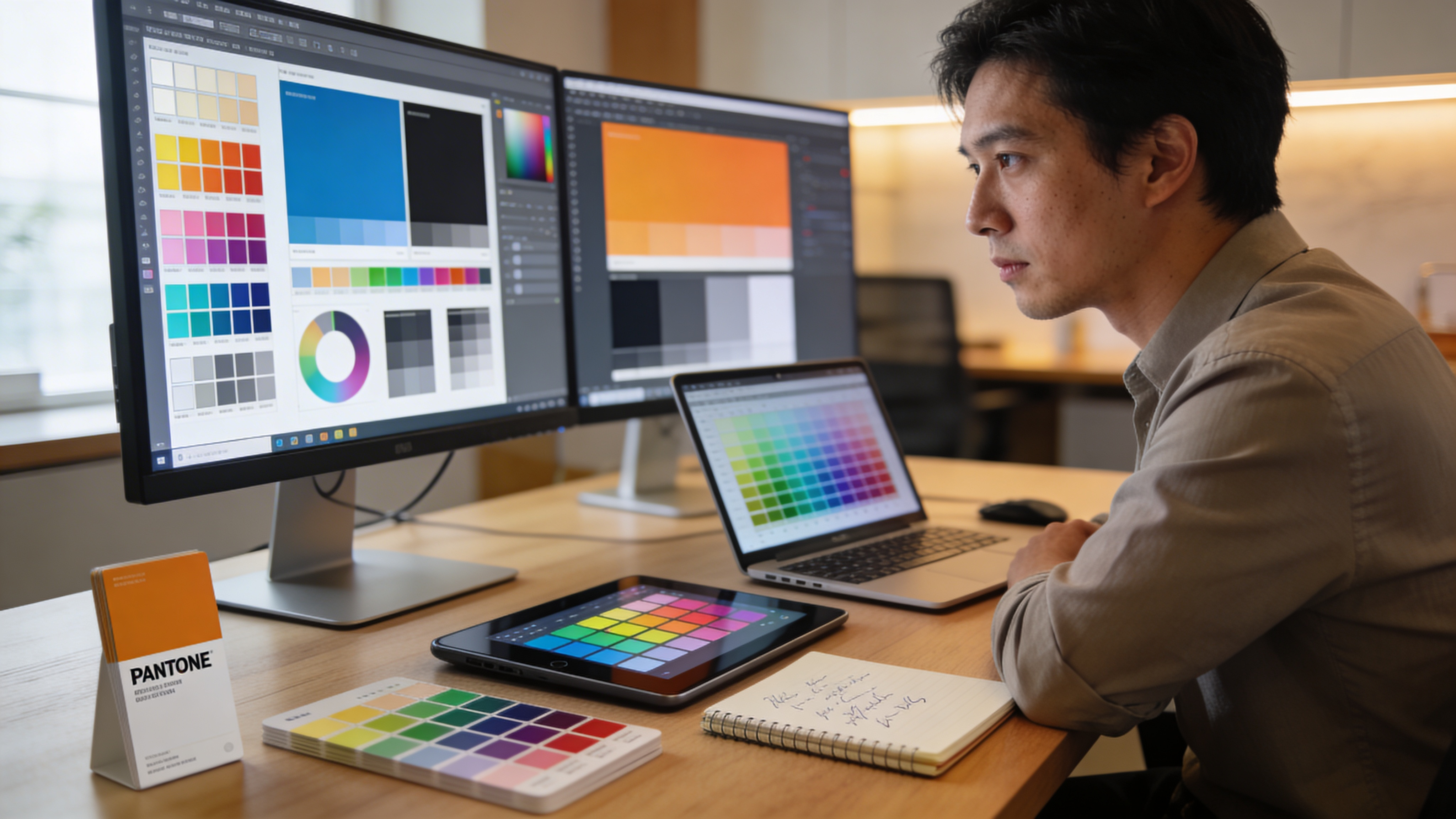
Step-by-Step Guide: Using a Color Blind Simulator
Now let’s walk through the practical process of simulating color blindness for your designs. This workflow applies whether you’re testing static images, UI mockups, or live websites.
Step 1: Prepare Your Design Assets
Before simulation, ensure your test materials represent your actual user experience:
For Static Designs:
- Export at actual display resolution (72-96 DPI for web)
- Include all color-dependent elements (buttons, icons, charts, status indicators)
- Test both light and dark mode versions
- Include hover states and interactive elements
For Websites:
- Test on staging or production URLs
- Check pages with forms, error states, and data visualizations
- Include mobile responsive views
- Test dynamic content like notifications and alerts
Step 2: Upload or Enter Your URL
Open your color blind simulator and choose your input method:
Image Upload: Most simulators accept JPG, PNG, GIF, and SVG formats. Upload your design file directly DeficiencyView processes images entirely in-browser, so your designs never leave your device.
URL Testing: For live websites, enter the URL to capture a screenshot automatically. This method catches issues that might not appear in static mockups, like dynamic content or browser-rendered fonts.
Step 3: Apply Each CVD Filter Systematically
Don’t just spot-check one CVD type. Work through each systematically:
- Start with Deuteranopia Most common, catches the majority of issues
- Check Protanopia Similar to deuteranopia but with different red perception
- Test Tritanopia Especially important for blue-heavy designs
- Verify with Achromatopsia Confirms pure contrast accessibility
For each filter, ask yourself:
- Can I distinguish all interactive elements?
- Do status indicators (success, error, warning) remain distinct?
- Is text readable against all backgrounds?
- Do data visualizations maintain meaning?
Step 4: Use Severity Adjustment for Nuanced Testing
Color blindness exists on a spectrum. Many users have partial CVD rather than complete deficiency. Advanced simulators offer severity sliders that let you test from 0% (normal vision) to 100% (full deficiency).
Testing at multiple severity levels (25%, 50%, 75%, 100%) reveals how your design degrades progressively. A design that works at 100% severity will definitely work for users with milder forms.
Step 5: Document Issues with Side-by-Side Comparisons
When you identify problems, document them effectively:
- Capture side-by-side screenshots (original vs. simulated)
- Note the specific CVD type and severity level
- Identify exact hex codes or design tokens causing issues
- Propose specific fixes with alternative colors
This documentation streamlines handoffs to developers and creates an accessibility audit trail for compliance purposes.
Common Accessibility Issues Revealed by Simulation
After running thousands of simulations, certain patterns emerge repeatedly. Watch for these specific issues:
Red-Green Status Indicators
The classic accessibility failure: using red for errors and green for success without additional differentiation.
Problem: Under deuteranopia or protanopia simulation, both colors appear as similar muddy browns or olives.
Solution:
- Add icons (checkmark for success, X for error)
- Include text labels (“Success,” “Error”)
- Use patterns or shapes as secondary indicators
- Choose colors that remain distinct under simulation
Low-Contrast Color Combinations
Some color pairs that look distinct to normal vision become nearly identical under CVD simulation:
| Original Pair | CVD Type | Simulated Appearance |
|---|---|---|
| Red + Green | Deuteranopia | Both appear olive/brown |
| Blue + Purple | Tritanopia | Both appear similar blue-gray |
| Orange + Green | Protanopia | Both appear yellowish |
| Pink + Gray | Achromatopsia | Nearly identical gray |
Learn more about accessible palettes and encoding for charts and UI to prevent these issues proactively.
Data Visualization Failures
Charts, graphs, and maps frequently fail CVD testing because they rely on color coding alone:
- Pie charts with red/green/orange segments
- Heat maps using rainbow color scales
- Line graphs with color-only legend differentiation
- Geographic maps with subtle color gradients
The fix: combine color with patterns, labels, or interactive tooltips that provide information without requiring color perception.
Link and Button Visibility
Links styled only with color (no underline) often disappear under simulation. Similarly, buttons that differ from backgrounds only by hue (not luminance) can become invisible.
Test all interactive elements at each CVD setting to ensure they remain identifiable and clickable.
Integrating CVD Simulation Into Your Design Workflow
One-off testing catches issues, but systematic integration prevents them. Here’s how to build CVD simulation into your standard process:
During Design Phase
- Test color palette selections before applying them to mockups
- Run quick simulations after each major design iteration
- Use palette and pattern rules from the data viz guide as starting points
- Verify that your accessible encodings pass all CVD filters
During Development Phase
- Test implemented designs against original mockups
- Verify that CSS color values match intended accessible colors
- Check dynamic states (hover, focus, active) under simulation
- Validate that third-party components meet accessibility standards
During QA Phase
- Include CVD simulation in your accessibility testing checklist
- Document all four CVD types in test reports
- Verify fixes actually resolve the simulated issues
- Cross-reference with WCAG contrast requirements
Using the Figma Plugin for Design-Time Testing
For teams using Figma, companion plugins allow real-time CVD simulation directly on the canvas. This eliminates the export-upload-test cycle and catches issues immediately as you design.
Combining Simulation with Contrast Checking
CVD simulation reveals color confusion issues, but it doesn’t measure contrast ratios. For complete accessibility testing, combine simulation with WCAG contrast checking.
WCAG Contrast Requirements
WCAG AA (Minimum):
- 4.5:1 for normal text (under 18pt or 14pt bold)
- 3:1 for large text (18pt+ or 14pt+ bold)
- 3:1 for UI components and graphical objects
WCAG AAA (Enhanced):
- 7:1 for normal text
- 4.5:1 for large text
A design can pass CVD simulation but fail contrast requirements or vice versa. Testing both ensures comprehensive color accessibility. DeficiencyView includes a built-in WCAG contrast checker that flags AA and AAA failures in real time alongside CVD simulation.
Testing Workflow: Simulation + Contrast
- Run CVD simulation to identify color confusion issues
- Check contrast ratios for all text/background combinations
- Verify interactive elements meet 3:1 minimum contrast
- Re-test any color changes through both simulation and contrast checking
This dual approach catches issues that either test alone would miss.
Real-World Application: Testing Your Own Vision
If you suspect you might have some form of color vision deficiency, simulation tools work in reverse too. You can take a color vision test to screen for CVD an 18-plate Ishihara-style test that detects red-green and blue-yellow deficiencies in minutes.
Understanding your own color perception helps you:
- Request appropriate accommodations at work
- Understand why certain color combinations feel confusing
- Advocate for accessible design in your organization
- Empathize more deeply with users who share your CVD type
Many designers discover mild CVD they never knew they had and it transforms their approach to accessible design.
Advanced Simulation Techniques
Once you’ve mastered basic simulation, these advanced techniques deepen your accessibility testing:
Testing Across Devices
Colors render differently across monitors, mobile screens, and print. Test your simulations on:
- High-DPI displays (Retina, 4K)
- Standard office monitors
- Mobile devices (iOS and Android)
- Projectors (for presentation materials)
Environmental Condition Simulation
Real users view your designs in varied conditions:
- Bright sunlight (reduced contrast perception)
- Night mode (affects blue light)
- Low battery brightness settings
- Aging displays with color shift
Combine CVD simulation with environmental factors for realistic testing.
Batch Testing for Large Projects
For enterprise applications with hundreds of screens, batch simulation saves time. Export multiple screens, run simulations across all four CVD types, and review results systematically rather than testing one screen at a time.
Building an Accessibility-First Culture
Tools and techniques only work when teams actually use them. Building a culture where CVD simulation is standard practice requires:
Education
- Train all designers on CVD types and their prevalence
- Share simulation results in design reviews
- Celebrate accessibility wins alongside visual design achievements
Process Integration
- Add CVD simulation checkpoints to design system documentation
- Include accessibility criteria in definition of done
- Make simulation tools available to everyone (not just accessibility specialists)
Accountability
- Track accessibility metrics across projects
- Include CVD testing in code review checklists
- Document accessibility decisions in design specs
When accessibility becomes everyone’s responsibility rather than an afterthought, simulation tools transform from occasional checks into continuous quality assurance.
Conclusion: See What Your Users See
A color blind simulator isn’t just a testing tool it’s a lens into how 300 million people experience your work. Every design decision that passes through simulation is a decision that works for the full spectrum of human vision.
Start today: take one of your current projects and run it through all four CVD filters in the free simulator. If you’re not sure how your own color perception compares, run a quick color vision test and then audit your UI with that context.
The gap between designing for “most users” and designing for “all users” is smaller than you think. With consistent simulation testing, thoughtful color choices, and attention to contrast, you can create digital experiences that work beautifully for every person who encounters them.
Your users with color vision deficiency won’t notice when your design is accessible they’ll simply use it without barriers. And that invisible success is the highest form of inclusive design.