WCAG 2.2 Beyond Color: 12 Criteria Color-Blind Users Need
2026-03-15 · Jamie Chen · 13 min read
TL;DR: WCAG 2.2 covers more than contrast ratios; use the simulator to catch color-only UI failures.
You’ve checked your color contrast ratios. Every text-background pair passes WCAG AA. Your site is accessible, right?
Not quite.
I spent the last eight years auditing enterprise SaaS products, and I can tell you: color contrast is table stakes. It’s necessary but nowhere near sufficient. I’ve walked into companies with pristine contrast scores and designs that locked out users with motor disabilities, cognitive conditions, vestibular disorders, and low vision that has nothing to do with color blindness.
The accessibility conversation has become too narrow. When WCAG compliance gets boiled down to “make sure your contrast ratio is 4.5:1,” we leave 80% of the criteria untouched. We miss motion that triggers seizures. We ignore keyboard users. We create text that’s impossible to scan. We build interactions that only work with a mouse.
This post is about seeing WCAG 2.2 as an interconnected system not a checklist of isolated rules. It’s about understanding why each criterion exists and how they work together to create experiences that work for everyone.
What WCAG actually covers (and why contrast is only the start)
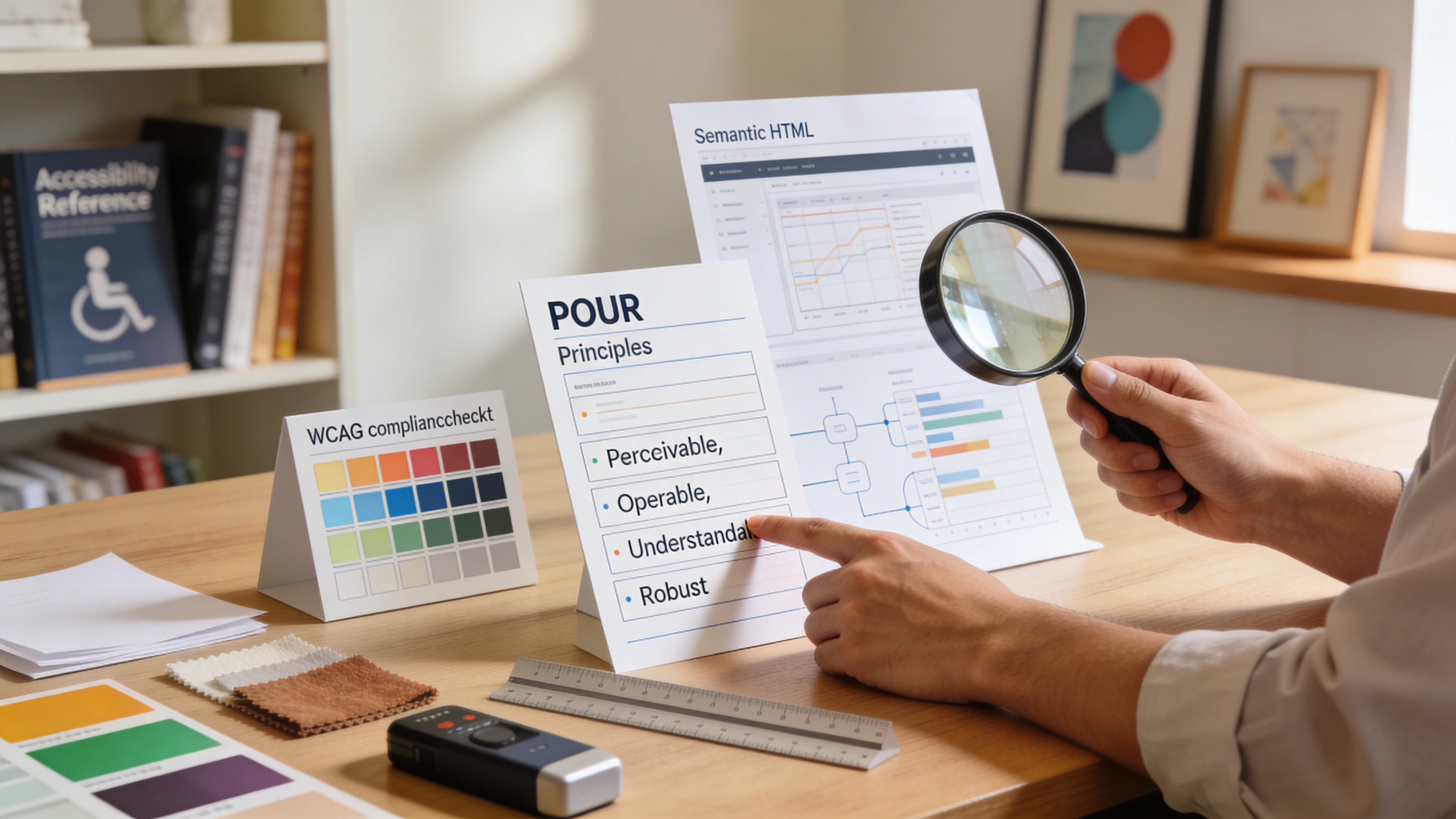
WCAG 2.2 has 86 success criteria organized under four principles: Perceivable, Operable, Understandable, and Robust (POUR). Most people know the acronym. Few understand the scope.
Perceivable covers how information is presented. Yes, color contrast lives here 1.4.3 (Contrast Minimum) and 1.4.11 (Non-text Contrast). But so do:
- 1.2.1 (Audio-only and Video-only): Captions and transcripts for multimedia
- 1.3.1 (Info and Relationships): Using semantic HTML so screen readers understand structure
- 1.4.5 (Images of Text): Actually using text instead of images containing words
- 1.4.12 (Text Spacing): Allowing users to increase line height, letter spacing, and word spacing without content loss
- 1.4.13 (Content on Hover or Focus): Making sure pop-ups, tooltips, and flyouts are dismissible and visible
Operable is about whether users can actually interact with your product. This includes:
- 2.1.1 (Keyboard): All functionality available via keyboard, not just mouse
- 2.1.2 (No Keyboard Trap): Users can navigate away from any component using only the keyboard
- 2.3.3 (Animation from Interactions): Giving users control over auto-playing animations
- 2.4.7 (Focus Visible): A visible indicator showing which element has keyboard focus
- 2.5.1 (Pointer Gestures): Not requiring complex multi-touch swipes for core functionality
Understandable makes sure people can actually comprehend your interface and content:
- 3.1.1 (Language of Page): Declaring the document language in the HTML
<html lang="en">tag - 3.2.1 (On Focus): Components don’t suddenly change when they receive focus
- 3.3.1 (Error Identification): Telling users what went wrong in a form, not just turning the field red
- 3.3.4 (Error Prevention): Confirmation steps for irreversible actions like deleting data
Robust ensures your product works with assistive technology:
- 4.1.2 (Name, Role, Value): Components expose their purpose, state, and value to screen readers
- 4.1.3 (Status Messages): Live regions that announce important updates without requiring focus change
Notice something? Color contrast appears in one principle, in two criteria. The other 84 criteria address motion, keyboard navigation, structure, semantics, error handling, focus management, and technology compatibility.
If you’re building with only color contrast in mind, you’re optimizing for maybe 2% of WCAG’s scope.
The cost of the narrow view: real examples
Let me show you what I see in the wild.
Example 1: The contrast-perfect dashboard that’s unusable for keyboard users
A SaaS analytics platform I audited had flawless contrast. Every number, label, and icon passed WCAG AAA. But every interactive element lived inside a custom dropdown that wasn’t keyboard accessible. Users with motor disabilities people who can’t use a mouse couldn’t access core features. The company had checked the color box and shipped it.
This violates 2.1.1 (Keyboard) and 2.1.2 (No Keyboard Trap), but nobody was looking.
Example 2: The notification system that triggers seizures
A financial app I tested sent real-time transaction alerts that flashed in bright red/green combinations. The contrast was perfect. The flashing frequency? 10 Hz well above the safety threshold of 3 Hz per WCAG 2.3.3 (Animation from Interactions). The company received reports of users having seizures. Contrast ratios had nothing to do with it.
Example 3: The form that only red means error
A healthcare portal I reviewed used red backgrounds for form validation errors excellent contrast, perfect color blindness accessibility. But for a user with tritanopia (blue-yellow color blindness), or for someone on a mobile device in bright sunlight where colors wash out, the red and green validation indicators were indistinguishable. Worse, there was no text, icon, or other non-color indicator. This violates 1.3.1 (Info and Relationships) and 1.4.1 (Use of Color), which states you can’t rely on color alone to convey meaning.
Example 4: The text that nobody can actually read
A startup had text with 7:1 contrast exceeding AAA standards. But the text was set in 10px Helvetica with line-height of 1.0 and no option to increase it. Users with low vision or dyslexia couldn’t read it. This violates 1.4.12 (Text Spacing), which lets users adjust spacing without losing content.
These aren’t edge cases. These are the kinds of accessibility failures that happen when organizations treat WCAG like a single-criterion checklist instead of a system.
Building holistically: the interconnected criteria
Think of WCAG not as 86 individual rules but as four layers that must all work together. Fail any one layer, and your product fails accessibility.
Layer 1: Make information perceivable beyond color
Color contrast is part of this, but it’s foundational, not the whole foundation.
Use semantic HTML to create structure. This satisfies 1.3.1 (Info and Relationships) and makes your information understandable to both humans and assistive technology.
Instead of:
<div onclick="handleClick()">Edit profile</div>Use:
<button>Edit profile</button>A <button> element inherits keyboard functionality, announces itself to screen readers, and maintains focus visibility automatically. You’ve just satisfied 2.1.1 (Keyboard) and 4.1.2 (Name, Role, Value) with six characters of code.
Never use color alone to convey meaning. Yes, red for error is intuitive but add an icon (✕ or ⚠), add text (“Error: email already in use”), or add position (put errors at the top of the form). This satisfies 1.4.1 (Use of Color) and creates a redundant signaling system that works for color blindness, low vision, and brightness washout scenarios.
Make text actually readable. This means:
- Minimum 14px for body text (16px is better)
- Line-height of at least 1.5
- Letter-spacing of at least 0.12em
- Allowing users to zoom to 200% without horizontal scrolling
- Respecting
prefers-reduced-motionin your CSS
These satisfy multiple criteria: 1.4.4 (Resize Text), 1.4.12 (Text Spacing), 2.5.5 (Target Size), and 2.3.3 (Animation from Interactions).
Layer 2: Make interaction operable
Operability means keyboard first, then mouse, then touch not the other way around.
Build for keyboard navigation. This isn’t hard:
- Use native HTML elements (
<button>,<a>,<input>) whenever possible - If you build custom components, add
tabindex="0"and keyboard event handlers - Never remove focus indicators users need to know where they are
- Test with Tab, Shift+Tab, Enter, Escape, and arrow keys
This satisfies 2.1.1 (Keyboard), 2.1.2 (No Keyboard Trap), and 2.4.7 (Focus Visible).
Control animations and motion. The web has gotten more animated and for some users, motion triggers vertigo, nausea, or seizures. Respect the prefers-reduced-motion media query:
@media (prefers-reduced-motion: reduce) {
  * {
    animation-duration: 0.01ms !important;
    animation-iteration-count: 1 !important;
    transition-duration: 0.01ms !important;
  }
}
This satisfies 2.3.3 (Animation from Interactions) and 2.3.2 (Three Flashes).
Make interactive targets big enough. Mobile users, people with tremors, people with low vision all need adequate hit targets. WCAG 2.5.5 recommends 44×44 CSS pixels minimum. This seems obvious but I see 20px buttons all the time.
Layer 3: Make content understandable
Understandability isn’t just about reading level it’s about structure, predictability, and error recovery.
Use a logical heading hierarchy. Don’t skip from <h1> to <h3>. This helps screen reader users navigate and gives everyone (including people with cognitive disabilities) a mental map of your content.
Write scannable content. Short paragraphs. Bullet lists for related items. Descriptive link text (“read the accessibility guide” instead of “click here”). This satisfies 3.2.4 (Consistent Identification) and helps people with ADHD, dyslexia, and cognitive disabilities consume your content.
Handle errors with clarity and kindness. Don’t just say “Invalid input.” Say “Your password must be at least 8 characters and include a number.” This satisfies 3.3.1 (Error Identification) and 3.3.3 (Error Suggestion).
Prevent irreversible actions. If a user is about to delete their account, send a confirmation email. Add a 24-hour grace period. Make it possible to undo. This satisfies 3.3.4 (Error Prevention) and protects against accidental actions, especially for users with motor disabilities.
Layer 4: Make technology robust
Robust code ensures your product works with assistive technology now and in the future.
Use valid HTML. Run your markup through the W3C validator. Broken HTML confuses screen readers. Valid HTML means:
- All tags closed properly
- IDs are unique
- Attributes have valid values
- ARIA is used sparingly and correctly
Use ARIA carefully. ARIA (Accessible Rich Internet Applications) is a standard for adding accessibility metadata to HTML. It’s powerful but dangerous misuse creates more problems than it solves.
<!-- Good: native element, no ARIA needed -->
<button>Save changes</button>

<!-- Bad: misused ARIA -->
<div role="button" onclick="save()">Save changes</div>

<!-- Necessary: custom component with ARIA -->
<div role="combobox" aria-expanded="false" aria-controls="dropdown">
  Select an option
</div>
Prefer native elements. Use ARIA only for custom components that can’t be built with HTML semantics.
Test with assistive technology. Download a free screen reader (NVDA for Windows, VoiceOver for macOS) and spend 15 minutes navigating your site. Listen to how it reads. Use the keyboard only. This will reveal gaps no automated test catches. This satisfies 4.1.2 (Name, Role, Value) by ensuring components actually expose their purpose to assistive tech.
WCAG conformance levels: what each one means
WCAG has three conformance levels: A, AA, and AAA. Most organizations target AA.
Level A is the minimum. It includes basics like keyboard access and alt text. It’s not enough for a professional product.
Level AA is the sweet spot. It adds contrast (4.5:1 for text), labels for form inputs, error identification, and focus visibility. Most accessibility regulations (ADA, AODA, EN 301 549) require AA.
Level AAA is comprehensive. It requires 7:1 contrast, audio descriptions for video, sign language interpretation, and expanded support for users with disabilities. It’s gold-plated and often unrealistic for commercial products but some sections (like government sites or educational content) require it.
The progression is cumulative: AAA includes all of AA, which includes all of A. So if you’re aiming for AA, you still need to meet every Level A criterion plus the Level AA additions.
Most organizations I work with aim for AA everywhere except:
- Marketing sites (often AAA for brand reputation)
- Healthcare and financial sites (often AAA for legal/ethical reasons)
- Internal tools (often just A due to budget constraints though this is ethically questionable)
Testing for holistic accessibility
Automated testing catches about 30% of accessibility issues. The other 70% require human judgment.
Start with tools, then use your brain.
- WCAG contrast checker for color contrast ratios
- axe DevTools (browser extension) for structural violations
- WAVE for visual feedback on issues
- Screen reader testing (NVDA, VoiceOver, JAWS)
- Keyboard-only navigation testing (disable your mouse)
- Motion sensitivity testing (enable
prefers-reduced-motion, watch how your animations behave)
But here’s what tools can’t do: they can’t tell you whether your form error messages are actually helpful, whether your heading hierarchy makes sense, whether your color-blind users can actually use your product.
That’s where real testing matters. Get users with disabilities involved early and often. Not just at the end. Not just as a checkbox. Involve them in design critiques, in usability testing, in prioritization decisions.
Practical WCAG implementation checklist
Use this to audit your own product:
Perceivable:
- Color contrast ratios are 4.5:1 minimum (AA) for text
- Non-color indicators (text, icons, position) reinforce all meaningful information
- Text can be resized to 200% without loss of content
- Images have alt text (decorative images use
alt="") - Videos have captions and transcripts
- Focus indicators are visible on interactive elements
Operable:
- All features work via keyboard (no mouse-only interactions)
- No keyboard traps (users can navigate away from any component)
- Interactive targets are at least 44×44 pixels
- Auto-playing animations respect
prefers-reduced-motion - Timeouts give users warning and let them extend sessions
Understandable:
- Page language is declared (
<html lang="en">) - Headings follow a logical hierarchy (no skipped levels)
- Link text is descriptive (“read more about WCAG” not “read more”)
- Form inputs have associated labels
- Error messages identify the problem and suggest solutions
- Consistent navigation and identification across pages
Robust:
- HTML is valid (no broken tags or duplicate IDs)
- ARIA is used only when necessary
- Components announce their name, role, and value to screen readers
- The site works with NVDA, VoiceOver, and other assistive tech
FAQ
Can I achieve WCAG AA without hiring an accessibility specialist?
Yes, but it’s harder and slower. If you’re on a budget, hire a specialist for a audit and training, then implement in-house. Most organizations need 40 60 hours of specialist time to get to AA baseline. It’s cheaper than the lawsuits and customer churn that come from inaccessible products.
Is color contrast the most important WCAG criterion?
It’s the most visible, but not the most impactful. Keyboard accessibility (2.1.1) affects more users and unlocks your entire product for people with motor disabilities. Semantic HTML (1.3.1) improves both assistive technology support and SEO. Error recovery (3.3.4) prevents catastrophic user experiences. Prioritize based on impact, not visibility.
How often should I test for WCAG compliance?
Every time you ship a feature. Accessibility is not a phase of development it’s a continuous practice. Automated testing every commit. Manual testing every sprint. Full audit every quarter or after major releases.
If I follow WCAG, will my product work for everyone?
WCAG covers a lot, but not everything. Some users have disabilities that fall outside the scope (rare genetic conditions, multiple simultaneous disabilities, emerging technologies). Think of WCAG as 95% of the way there. Fill the last 5% by listening to your actual users.
Which WCAG level should I target?
AA is the standard. If you’re building a commercial product, you’re likely legally required to meet AA in the US, Canada, UK, EU, and Australia. Aim for AA everywhere, except:
- Government and public institutions → often AA (sometimes AAA)
- Educational content and nonprofits → AA to AAA depending on mission
- Enterprise SaaS → AA minimum (AAA for premium tiers sometimes)
How do I explain WCAG to my manager or stakeholders?
Start with legal and business impact. “WCAG AA compliance reduces legal risk and expands our addressable market to 15 20% more users.” Then move to ethics: “Our product should work for everyone who wants to use it.” Then show the technical ROI: “Building accessible from the start costs 5% more in development time but saves 50% in rework.”
Bringing it all together
WCAG 2.2 is a system. Color contrast is the most visible piece, but operability, understandability, and robustness are equally critical. Miss any one of them, and you miss entire groups of users.
The companies doing this well don’t think in terms of criteria. They think in terms of users:
- People who can’t use a mouse need keyboard access
- People with seizure disorders need motion control
- People who are deaf need captions
- People with cognitive disabilities need clarity and error recovery
- People with low vision need readability, not just contrast
- People using assistive technology need semantic HTML
Start there. Then map those user needs to WCAG criteria. Build the intersection. Audit continuously. Involve real users.
Contrast matters. But it’s the beginning of accessibility, not the end.
Test your website’s accessibility across all four WCAG principles with our free WCAG contrast checker and CVD simulator see how your design performs for color blindness, then expand your testing to keyboard navigation, motion, and structure.
Related Articles
- Color blind accessibility tools for designers
- Testing your website for color blindness
- Using a color blindness simulator for accessible design
Test your designs against all four CVD types right now with DeficiencyView’s color blindness simulator upload any image or enter a URL and see results in seconds.